Development Update - First Impressions

First impressions are so important. If I start up a game, I don't usually judge it by the main menu. In most cases this is a static screen with a few options. So okay, a regular main menu doesn't usually make me feel one way or another, but what if the menu itself was awesome? Every now and then you play a game that has a 3D menu. I immediately think of the last of us.
And what if that menu was dynamic with things going on?
And what if that menu contained clues about the game?
And what if the options menu was on the TV?
and... and... and...
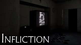
I asked myself all these questions and came up with this:

If the player chooses, they can sit in the main menu for a while and things will happen. The clocks in the room tick down time. A video on the TV plays through. Different random background ambience plays each time you enter the menu among other things.
There's something about giving your game a proper introduction. For some reason it feels far more complete now than it did before. The next real challenge I have with this is to make it game pad friendly. I'm still scratching my head about the best way to do this. Particularly with the drop down menus on the options screen.
I had so much fun making this menu scene and the video within. I know most players will just click past it but for those that are interested, you may learn something that will help you before you've even started the game.


